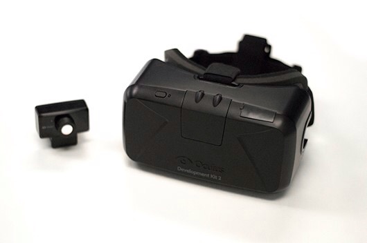
The last (and only) times that I played Elite: Dangerous with the Oculus Rift before this weekend were for a few short minutes on a DK1 at the Games BAFTAs and a DK2 at EGX, both earlier this year. Each time I came away wanting to add an Oculus headset to my hardware setup.
This weekend I was able to spend a lot more time with a borrowed DK2, playing my own game on my own system and I found the experience a little different from those previous outings.
So what’s different? Let’s first take a look at where the DK2 falls a little short.
Playing the demos before, there was no need to use the menus much, so although the text was blurry it didn’t seem to matter a great deal. In fact, because I had been so intent on shooting down those pesky enemy ships, I hardly noticed the text at all. But those side menus really are hard on the eyes, and in particular the modules menu is almost completely illegible. You need to know more or less what the words are so you can recognise them through the Rift. Other text though is much better, such as the “Safe to disengage” notice and the comms and status panels. Still not perfectly crisp but quite readable.
I hadn’t tried using the galaxy map on the Rift before and that turned out to be very awkward to navigate. Maybe Frontier will be able to make that better as time goes on. It wasn’t so much a case of not being able to see what’s on screen, more an issue of where and how to focus on a target system you’re interested in. It seemed somewhat random as to which system was selected when you clicked on what you thought you were looking at. Again the text rendering on the left hand map menu was poor, but that seems to be a common condition. One word of warning: resist spinning the damned thing around too much or it’ll probably make you very dizzy.
The System Map interface was better, once I got the hang of dragging the map around to focus on something in the targeting box. And zooming in to get a nice close-up of a star is quite amazing. It hangs there in front of your eyes, glowing and burning like a bazillion degree beach ball.
Finally, pixellation. Yes the DK2 still suffers from this but against the dark background of space where you’re probably looking most of the time, it’s not really that noticeable. Ships that appear a long way off were showing signs of colour bleeding most probably because of the pixel density of the screen, so a white pixel might actually split into two or three coloured dots depending on how you’re looking at it, and that’s a bit irritating, but given the optical arrangement, focal length and screen type it’s probably not surprising.
As far as setting up goes, my Windows 7 install was pretty straightforward. Download, run the setup, plug everything in, and once the drivers are in, configure for extended desktop (note that’s not the default Rift option), rotate it 90 degrees and you’re almost ready. Start up Elite, switch to Oculus 3D mode and then to the secondary monitor (which is the Rift under extended desktop mode). Quit and restart and you’re good to go. I did find that I had to sit patiently looking at the screen (or the head tracker anyway) until the game had loaded or the opening screens are lurking somewhere over your left shoulder.
So with all that out of the way, what are the good points that the DK2 brings to Elite?
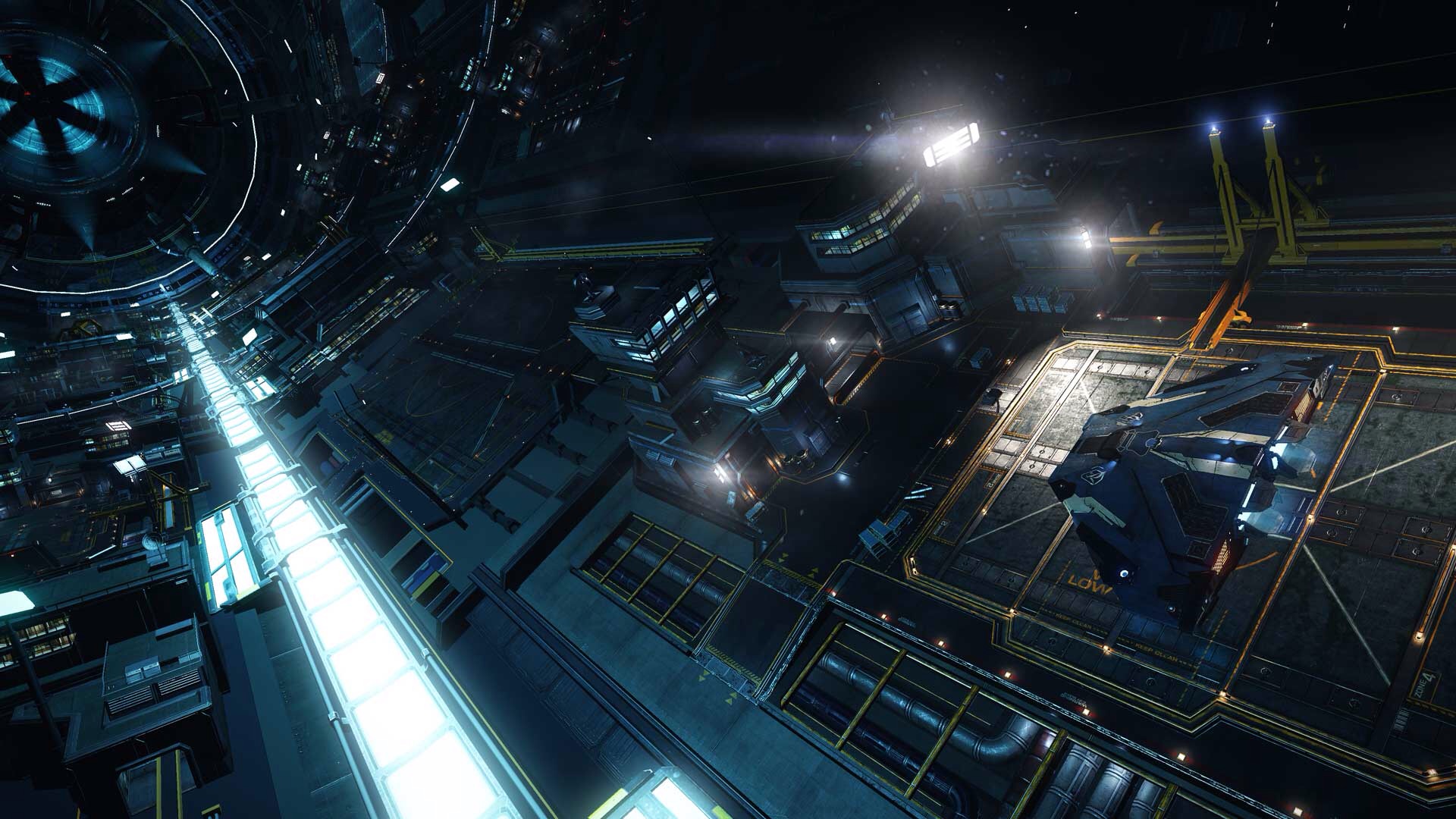
In short: immersion. Like I’ve never experienced before. From the moment you’re first dropped into the seat of your ship everything feels real. The hangar structure looks strong and industrial. Steam vents are convincing, and looking around gives a much better sense of the hangar’s size and function than I ever got from a flat screen. In fact it feels much bigger than pre-Rift.
Take a look behind you, there’s the door at the rear of the cockpit, ready and waiting to become functional when we get to move about in the ship at some point in the future.
Look down and you can see the floor, some way below your seat. Wow, we’re quite a way up! Sit up and look over the nose of the ship, and left and right over the leading edges of the hull / wings.
All pretty powerful stuff, and we haven’t even moved (the ship) yet!
Before you return to the surface, take a moment to drop in to the outfitting screen. That is very different to the flat-screen experience; you get a much wider (dizzying) view of the ship from the front, rear and underside, and the livery menu gives you an even wider and higher field of view to take in all that hangar space (don’t forget to look all around).
Ok, when you’ve calmed down again, we’ll head to the surface. The platform shifts us forward and pushes us up in to the OH MY – the station vista is incredible. I mean, it was impressive before but now… you can look anywhere, and it’s smooth and fast. Cast your head around, and just LOOK at what’s going on around you. The headlook mouse mode that I used to use now feels really limited, even though in theory you’re seeing the same views as before, now it just feels all-encompassing, and having the ability to peek here and there by shifting around in your seat is just so… right.
To be honest, I spent about 5 or 10 minutes just sitting there, watching ships come and go through the station entrance high above my landing pad. It’s dead easy to target each ship as you track it visually, then a quick peek at our dashboard gives us the info on the ship, as always, but without flicking views with buttons. All very nice.
Ok time to undock. As we pull up from the pad, a visual check directly above confirms that we’re not about to hit anything and so a little thrust here and pitch there and we’re ready to push out into the hard vacuum of space.
Passing through the mouth of the station is also far more natural now. You can look left and right, up and down, all without fear of colliding with anything because again you don’t have to switch views with buttons or the mouse and it’s the way we’re used to perceiving our environment. Which is slightly strange to say because we’re sitting in the cockpit of a space ship departing from a space station big enough to accommodate who-knows-how-many people?
Outside is also a visual treat. Sunlight casts shadows through the cockpit, ships leave contrails in the distance and stars fill the sky. Then of course there’s the planet we’re orbiting, which, as you turn your head to look at it, hangs there in the void, a tangible massive-looking thing, semi-illuminated and stunning in its beauty.
A little rotation and pitch brings the station in to view too. Incredible detail, illumination, movement and a sense of scale makes the whole scene so believable.
Of course everything I’ve described is present in the flat-world (which is how I’ve come to think of it now) view too, but the immersive nature of the Rift brings about an illusion of reality that I just hadn’t been able to pick up on before. Which, I guess, is the whole point.
So the next couple of hours were spent just wandering about a bit. A touch of mining here and the odd contract there. In and out of hyperspace, docking and launching at outposts, before finally arriving back at a Coriolis station, where it became obvious that rolling, and pitching and thrusting at the same time was probably not the best way to approach docking with the Oculus, as I made myself pretty dizzy and had to take a break after touching down.
So sure, the text rendering is awful in places, and it can be frustrating trying to identify things on the the ship’s system panels or to select things on the galaxy map. Small things a long way off may occasionally look like two or three dots instead of one, but even so, the total immersion that the Rift DK2 brings is astounding. Even after having tried it twice before for short spells.
I don’t know if I’ll be able to play in glorious Rift 3D all the time, but I know I’ll miss it when I don’t!
The images used in this post were nabbed from elitedangerous.com and oculus.com.


